Artist’s impressions have long been used by the government as a way to sell major projects to the public, but in 2016 we have seen this tool adopted by a new user – community groups opposed to the same projects.

It begins
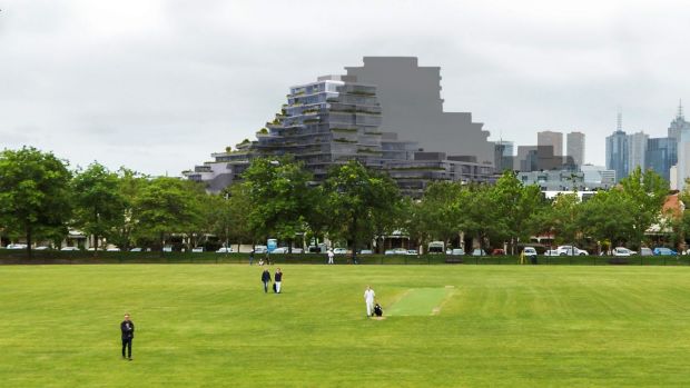
The first volley came in March 2016, when a Murrumbeena resident opposed to ‘Skyrail’ commissioned a series of computer generated images to depict the impact he believed the works would cause to the local area. It was then picked up in the local newspaper:

A Murrumbeena man has commissioned his own images of the controversial elevated Skyrail proposal in an attempt to create more discussion on the project he says will “utterly change Melbourne”.
The release of the images, which Edward Meysztowicz had created to accurate dimensions obtained from the Level Crossing Removal Authority.
Mr Meysztowicz said he was prompted to create the images of the rail line after being refused permission to photograph artists’ impressions created by the Level Crossing Removal Authority.
The images he commissioned use images of Mr Meysztowicz and his family under the line and also include a perspective from the Skyrail trains, looking down into backyards.
April 2016 saw a resident on the Frankston line use the same tactic to assist their campaign against elevated rail in their local area. Again, it got a run in the local newspaper.

An anti-Skyrail campaigner has commissioned an artist’s impression of what he thinks an elevated train line could look like through Bayside suburbs.
But the Level Crossing Removal Authority (LXRA) said that the sky rail drawings were inaccurate and promised to provide detailed designs of the options for the Frankston line, south of Cheltenham, at the next community consultation session.
“The image is not an accurate representation of what the eight remaining level crossing removals will look like on the Frankston line,” project director Adam Maguire said.
Simon Johnson, noskyrail.com.au founder, said he commissioned the drawings, based on information about the Cranbourne-Pakenham rail corridor.
He said his images were a balance to the “unrealistic” concept designs provided by the LXRA for the line.
You might call the above Skyrail artist’s impressions biased, but you can’t really call them misleading – each was clearly marked as the work of groups opposed to the project, so the reader was able to evaluate them based on the context they were created.
Problems begin
Images used in the media have a habit of being reused outside of their original context, and in the case of the Skyrail images things are no different. This is but one example.

Note the simple “artist’s sky rail impression” caption and the “supplied” attrition – no mention of the original creator and their intentions.
Into murkier water
December 2016 saw a third group roll out the – residents opposed to a shallow Melbourne Metro railway station beneath St Kilda Road. Their imagery made it into The Age.

This time they really take the cake – adding a pall of dust to the air to complete their dystopian vision.

The Save St Kilda Road Group has also released an artist’s impression of its vision of St Kilda Road in the midst of construction, showing barren streets and a pall of dust surrounding the Shrine of Remembrance.
Spokeswoman Marilyn Wane said the group was angry that an application had been made to remove trees, shut down roadway and reroute trams before the station design and location had been determined.
In the case of this artist’s impression, The Age is treading in murky territory. Appearing in an article describing the wider impact of the Melbourne Metro rail tunnel project, with the
providence of the image is buried away in the article text, a less careful reader could easily take the image at face value, and not take into account the bias of the group that commissioned it.
And into the danger zone
January 2017 saw this article in The Age – Developer warns Fitzroy North resident over ‘grossly misleading’ image.
The article continues:
A developer has taken the unusual step of threatening an individual resident over their inaccurate depiction of a controversial apartment plan in Melbourne’s inner north.
Residents whose homes will be affected by the $85 million plan have run a well-resourced campaign featuring a depiction of the tower’s impact on city views from a nearby football grandstand.
Such was the impact on local perceptions of the project that lawyers Arnold Bloch Leibler, acting for Gurner, wrote to resident Glen McCallum over the “grossly misleading” images.
Tim Gurner, whose company is behind the plan for Queens Parade, also paid architectural rendering firm FloodSlicer to draw an accurate version of the tower.
It shows a far less dramatic impact on the city skyline.
Mr Gurner said the letter was not a threat. “We were very concerned about someone out there very clearly suggesting that his image was correct – it was grossly misleading.”
Mr McCallum said he had created his image because Gurner had not provided one showing the impact on the city skyline from a local park, the Edinburgh Gardens.
“They refused to provide an actual render so I think they were trying not to allow this to be speculated on,” he said, describing his depiction as his “best effort”. It has since been removed from his website.
Intentionally misleading the public via an artists impression is one thing, but in this case the story seems a little different – someone put together what they thought was an accurate image, got called out on the inaccuracies, and then took it down.
What is bias anyway?
One can’t argue that the artists impressions created by opposition groups are ‘bad’ for being biased – the government has been known to do exactly the same thing when promoting their projects!
A good example is this 2014 image showing the ‘Cycle Spiral’ – part of the proposed East West Link. Idyllic scene, isn’t it?
However the reality of the proposed bridge was anything but, as Andrew Herington wrote in a piece titled ‘Cycle Spiral is total spin‘.
This view looking south omits the 8 lanes of Flemington Rd which run across the immediate foreground with a new major intersection just off the bottom right hand corner. A new divided arterial is also not depicted although it is to run beneath the Cycle Spiral and the Citylink pylons visible in the middle distance.
The following blow up of the actual design give a much better picture of where the Cycle Spiral sits. Note there is no reassuring “sound tube” in this view and still no sign of the road that runs beneath Citylink. However it does give an indication of the heavy shade and the overwhelming presence of major roads on all sides missing from the “artists impression”.
The truth is this – any image can be biased, computer generated or not. Even photographs of a location can be spun to give the viewer completely different impressions. For example – dark and unfriendly.

Or bright and welcoming.

The possibilities are endless, such as my trenched railways are ugly and making a railway cutting look good posts a few months ago!
In the end there is only one solution – the reader has to keep in mind who is behind the message.

One of your best articles. I read “How to lie with statistics” over and over, now I’ve seen “How to lie with photos”.
I should pick up that book one day.
Yes well just about every image, whether produced by governments or developers for their projects, are always from the best angle – Ive seen so many for developments over 25 years, that I just ignore them, they’re always misleading. Amongst skyscraper enthusiasts, they call them the ‘hero perspective’, usually drawn from a point a few floors up or even half way up, and often not showing nearby towers under way or already permitted ! That one by the Fitzroy developer is an exception, and accurate render thats shows its almost as large as the opponents depiction. Though if there’s only one image out there, then thats the one that that sticks – so in the case of these rail projects, the construction authorities ought to put out their own renderings.
Artists impressions also love to include people just lounging around enjoying parkland, despite how useless said pieces of land may be in reality.
Hello Marcus
You seem to be an expert on St Kilda Rd, or is that an expert on ‘artist impressions’?. I can assure you that if you read the 800+ pages of EES documentation and the further hundreds of pages of MMRA documentation seeking a heritage permit to bulldoze over 800 metres of our premier boulevard as it passes the Shrine of Remembrance to build an ‘underground’ station, then you would understand that this ‘artist impression’ is just the tip of the iceberg. The palls of dust will be reality along with massive traffic chaos – and it will go on for 8 long years.
Do you think The Age would print it if it was fantasy?
I suggest you familiarise yourself with the subject matter before you spout off as an expert.
I don’t wake up in Geelong but now I am faced with being kept awake 24/7 by MMRA construction that is so poorly planned it will destroy a magnificent boulevard that ALL VICTORIANS have a right to preserve.
The MMRA website shows that the Domain station construction site would extended from Dorcas Street to Toorak Road – the 800 metres you refer to.
http://metrotunnel.vic.gov.au/locations/domain/constructing-domain-station
Examples of massive holes in the ground that once existed around Melbourne include:
– Museum station site on La Trobe Street during the 1980s: single street for a single city block / 200 metres.
– QV Melbourne complex at Swanston and Lonsdale Street in 2012: one entire city block, 200 metres by 100 metres.
– Emporium Melbourne complex on Lonsdale Street during the mid-2010s: 2/3 city block, 150 metres by 100 metres.
– Frankston line grade separation works from Ormond to Bentleigh in 2016: three tracks wide and 2.4 kilometres long.
Work on the shopping centre developments was only during normal hours: a few months digging a hole, followed by a year or two of construction work inside it. The level crossing removal project was around the clock work, but only went on for a few weeks.
Poorly executed excavation works will cause a cloud of dust, but I’m struggling to think of a project in Melbourne that has resulted in a pall of dust like that featured in the artist’s impressions commissioned by the Save St Kilda Road Group.
I spent months photographing demolition and excavation work at the Emporium Melbourne site – dust is visible around machinery, but no clouds.
https://www.flickr.com/photos/legoblock/sets/72157627837443206/
I also spent a great deal of time photographing level crossing removal projects around Melbourne – dusty machinery and mud caked on local roads was the main negative impact that I saw.
https://railgallery.wongm.com/page/search/tags/level-crossing-removal-project/
I’d rather not have either happening next to my house, but the amount of dust isn’t any different to any other construction project seen in Melbourne.