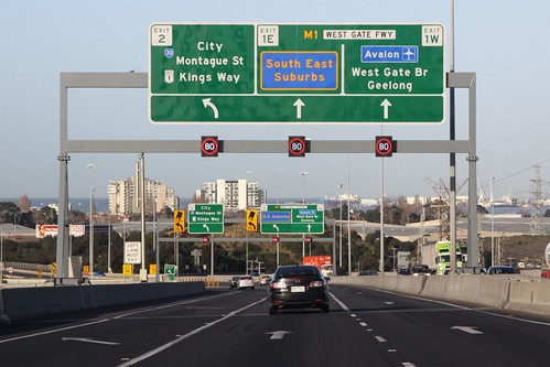
Digital maps have taken over from traditional paper street directories and fold out maps, but it doesn’t mean the information made available to the reader is any better, if my recent experiences with Google Maps are anything to go by.
Take a look at this Google Maps view of Melbourne’s western suburbs, where I’ve circled the freeway interchanges.

The interchange of the Western Ring Road and the West Gate Freeway doesn’t look too bad – both freeways appear in the same dark orange colour, with the surrounding local roads displayed in a slightly lighter shade, as are the ramps to Geelong Road.

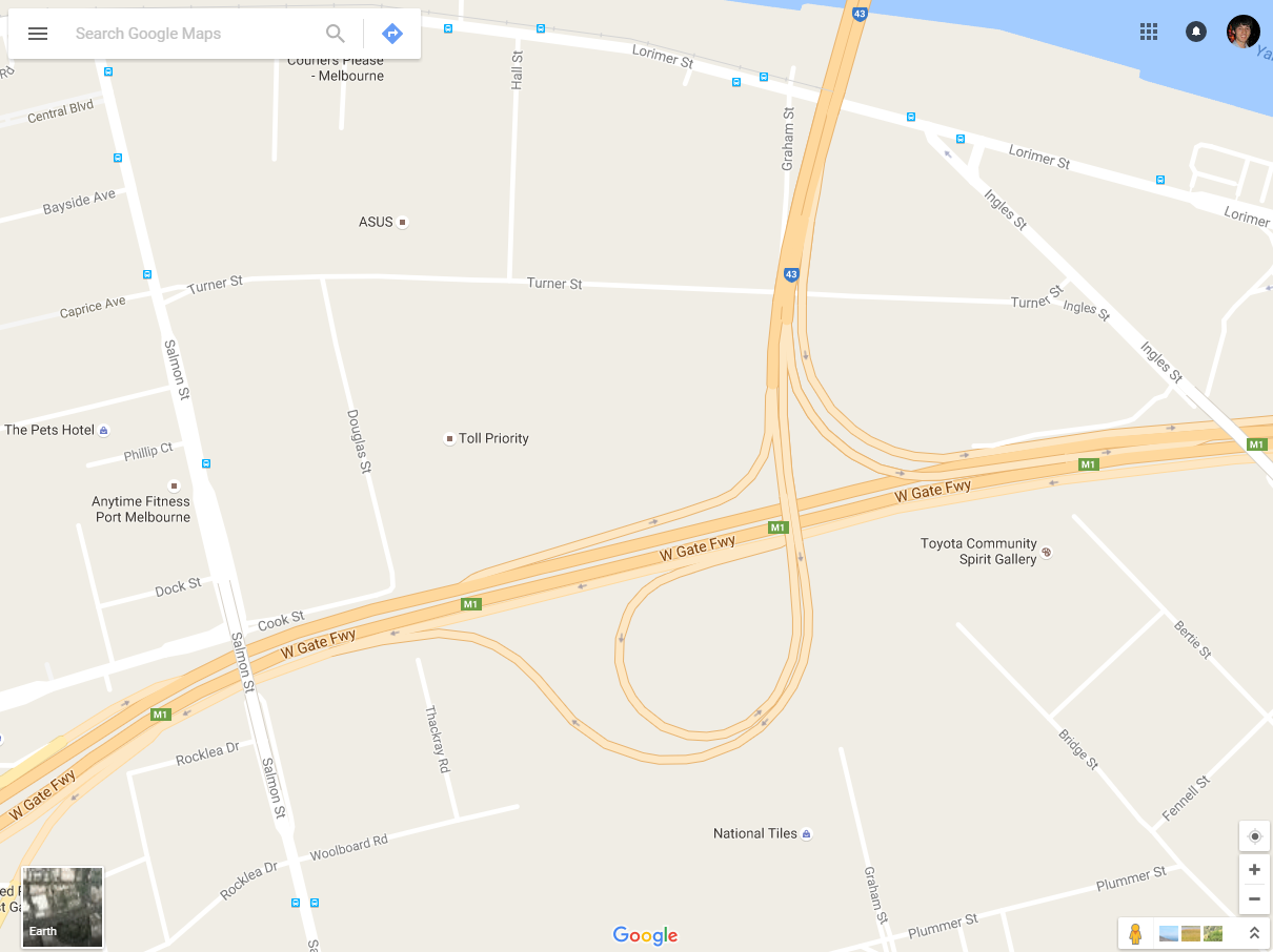
A bit more confusing is the junction of the Bolte Bridge and West Gate Freeway – the ramps linking the two are shown in a different shade to the freeways themselves, making the map harder to read.
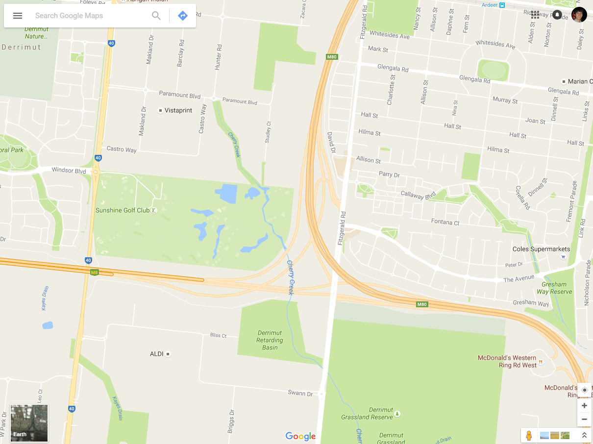
But the junction of the Western Ring Road and Deer Park Bypass is virtually unreadable – the ramps linking the freeways are coloured so light they almost disappear into the grey background.
The same flaw can be found where the Metropolitan Ring Road and Craigieburn Bypass meet in Melbourne’s northern suburbs.

Turns out the art and science of drawing maps is hard – that is why the field has a name: cartography.
Footnote
In 2016 American cartographer Justin O’Beirne wrote this piece on changes to Google’s cartography.
Looking at the maps, there are more roads than there once were—and fewer cities.
I wonder what drove these changes?
One thing’s for sure: today’s maps look unbalanced. There’s too many roads and not enough cities.
As well as comparing Google Maps with Apple Maps.
Both are in a race to become the world’s first Universal Map — that is, the first map used by a majority of the global population. In many ways, this makes Google Maps and Apple Maps two of the most important maps ever made.
Who will get there first?
And will design be a factor?
In this series of essays, we’ll compare and contrast the cartographic designs of Google Maps and Apple Maps. We’ll take a look at what’s on each map and how each map is styled, and we’ll try to uncover the biggest differences between the two.
I wonder how often a human at Google actually looks at the maps that their automated systems generate.

Across town you will see the South Gippsland Freeway to Lyndhurst has been ‘de-freeway marked’ for lack of a better term as well as the freeway standard bypasses of Drouin and Warragul (soon to be freeway back past Longwarry with the new interchange). Strangely the bypasses of Moe and Morwell are marked freeway standard on Google, albeit the Morwell section doesn’t quite to the to eastern interchange.
Google has been odd on this matter marking sections freeway then reverting back and forth – notably the Hume Highway which is nominally ‘freeway’ with a string of at-grade intersections with generally the town bypass sections built to proper standard. This was marked freeway standard then removed then reinstated as it currently is.
Over here in Perth the short Graham Farmer Freeway has had the same treatment the South Gippsland Freeway got before being recently reverted back, but the Mitchell Freeway interchange is still marked as you’ve indicated above. Perth’s metropolitan ring road is formed by the Roe and Reid Highways which are now freeway standard for much of their length but not entirely – notably the north eastern section where it reverts to single carriageway in part with several at-grade intersections in the area. The whole route was marked freeway standard then removed except for a bit of Reid Highway including oddly a bit west of the Mitchell Freeway that is never intended to be freeway! The entire Roe Highway south of the Tonkin Highway at Forrestfield is freeway standard but not marked so by Google.
The Tonkin Highway which parallels the Mitchell-Kwinana corridor has also had the same treatment with currently the only section now being marked as freeway the middle section which was fully upgraded to freeway standard as part of Gateway WA. The northern section is currently being done as part of North Link WA and extended to Muchea – It will be noteworthy how Google mark this out.
I wonder how much input Google staff in Australia have on their mapping product, or whether it is just low paid grunts overseas who take user feedback and make the changes?
One thing you learn pretty quickly in cartography is that automatic map generation is extremely difficult. Even if the data (e.g. road classifications) has been flawlessly edited by humans, the automatic placement of labels to avoid overlapping and maximise readability and clarity is much more difficult than you might imagine.
Of course, Google Maps has the added problem of not having the manpower to curate and clean up all the data, which is a surefire way to generate bad representations, even with the best algorithms in the world (which is probably not an overstatement of the incredible quality of Google Maps’ display algorithms).
Having a go at cartography yourself makes you appreciate the sheer amount of effort that goes into making a map book like the Melway. Even PTV’s local area maps must take a huge amount of manual effort – much more than you might think at first glance.
Back in year 7 or 8 I had a geography assignment to draw a map of my local area – I put an amazing amount of work into drawing it, but that was more due to my love of maps rather than the expectations of my teacher.
Check out the traffic direction arrows on this online Melway map from several years ago, of the Tullamarine Fwy/ English St/ Matthews Ave interchange at Essendon Fields. Melway might not have been the only map that had this particular error. I believe it has been resolved now. It would possibly change with the works that are happening there anyhow.
https://goo.gl/photos/sSyQXcFMFjnPiY2n7 (I hope the picture can be viewed!)
That is quite the screwup – hopefully driverless cars don’t rely on that data!
[…] I can’t find any official reference to the name in the Land Victoria database, but Reverend John Flynn, founder of the Royal Flying Doctor Service, grew up in Sunshine – is this street a tribute to him, or just another mapping error? […]