You have arrived at Flinders Street Station and you’re trying to find where your trains leaves – so where do you look?

You’re probably going to look at one of these screens – but what order are the trains being displayed in?

It isn’t alphabetical – South Morang occupies the first two slots. Is it ordered by the network map? Possibly – Cranbourne is next to Pakenham, and Alamein is next to Glen Waverley.
Worked it out yet?
I’ll give you the answer – the next two services for each line are displayed, no matter where they terminate, and the lines are grouped by their operational ‘groups’ – ‘Clifton Hill’, ‘Burnley’, ‘Northern’, ‘Caulfield’, ‘Cross City’ and V/Line.
The same ordering logic is applied on the smaller ‘summary’ boards scattered around the station, just squeezed into less space and with a smaller font.

Given that the PTV network map has shown each group of lines in a different colour since 2017, why do the screens at Flinders Street Station persist with living in the monochrome past?
Fixing the problem
Turns out Transport for Victoria asked the same question in 2017 and set to work finding a better way, lead by senior user experience designer Carolina Gaitan.
They defined the problem in terms of user experience.

Then came up with a way to test out their hypothesis.
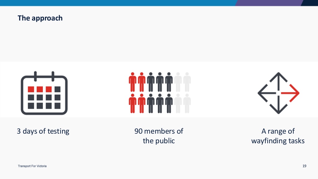
Spending three days sending people through a mock up railway station.

First navigating using the current monochrome design, then a new design where each railway line was a separate colour.

And the result – navigating the station was was easier with colour.

What else did they find?
An important part of the new design was realising that there two groups of users of Flinders Street Station: people unfamiliar with the station, and those who use it every day.
Some signage is tailored for people trying to find their way somewhere new.

While others deliver ‘how long until the next train to X’ information to regular users.

So what next?
Turns out what was learnt through user experience testing is being put into practice, with a wayfinding upgrade coming soon:
Flinders Street Station will be the first station across the metropolitan network to feature signage and information screens where each line has its own colour for easier navigation.
Though I take offence to the boastful “first station” claim – until the 1990s the Melbourne train network used a different colour for each group of lines.
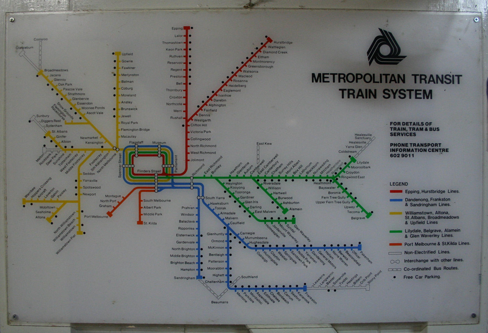
As did the next train displays in the City Loop until 2011.

Everything old is new again?
A signage related footnote
Designer Shane Bradbury explains the new style of regulatory signage as well the suite of maps that appear around Flinders Street Station.

Further reading
You can find a summary of work at the UX Australia 2017 website: ‘Flinders Street Station: A journey to implement UX in wayfinding and customer information‘. The full set of presentation slides is also available.
Alexandra Almond has also published an article on the design process, titled Improving wayfinding at Melbourne’s busiest train station.
Meld Studios has also covered their role in the redesign of both the ‘motherboard’ screens at the station entrance, and the platform screens.

I hope one day they’ll put up basic information such as when is the next direct train to North Melbourne, Southern Cross or Richmond.
They have screens like that at North Melbourne, Richmond and in the City Loop – and Flinders Street too, but you have to squint to see it!
Wayfinding in Melbourne is pretty poor.
You often need to guess how to get from one side of the CBD to the other side.
If you followed advice from station workers, you would end up too many times going twice around the loop.
I’d be amazed if anyone would be able to memorise all of these permutations of City Loop operating patterns!
https://www.ptua.org.au/2012/10/10/city-loop-maps/
It will be interesting to see if some of these changes are also applied to the PTV application and Google Maps. Two things that tourists to Melbourne are encouraged to use. Google Maps currently only shows the XPT in colour on the map of Melbourne. It would be incredibly helpful if they could show the line colours on Google Maps.
Good point – NSW does use colour in their GTFS feed to Google, but only orange = train and red = light rail.
Marcus, I have discovered that the “unfamiliar users” system was in place in NSW at least 30 years ago, where it was apparently a “disaster” – not least because it had to be updated manually by an operator!
http://cdn.timetable.org.au/thetimes201612issue.pdf
The Australian Timetable Association carried the story in its December 2016 newsletter.
Hopefully a modern, automated version of the system will be a little more successful!
Nice find – thanks!
[…] plans to make it easier for passengers to navigate through Flinders Street Station by making the wayfinding signage clearer to follow – but during my travels around Me;bourne’s rail network, I’ve spotted a different […]
Marcus,
Would Flinders Street Station be easy to navigate for commuters who are blind and/or deaf? What advice would you give such persons?
Thanks!
I can’t imagine how a blind person would be able to successfully navigate Flinders Street Station without assistance or lots of preparation ahead of time – there is tactile paving on the concourse and Braille buttons on the lifts, but nothing else to help you find the platform you want.
As for finding which platform your train is on – trains to a given destination don’t use the same platform at Flinders Street Station 100% of the time, which makes pre-planning difficult.
There isn’t any audible way to find out once you arrive, so you’d need to resort to an app on your smartphone and hope it works with accessibility tools, or walk down to each platform, waiting for an audible announcement to play, and see if you have arrived at the right one.
For the purposes of comparison, this is a tactile map I found in Hong Kong, that have been added at many stations.
The braille text provides guidance information, while the map is three dimensional, showing the accessible routes through the station. It even plays a cute musical tune for vision impaired people can find it among the busy station!
They also publish a schematic diagram of every station on their network, so you can plan ahead of time what route you need to follow from street to platform.
http://www.mtr.com.hk/en/customer/services/system_map.html
Hi Pierce,
If you are still looking for advice I would recommend contacting Traveller’s Aid (https://www.travellersaid.org.au/). They are a not-for-profit organisation dedicated to helping visitors with disabilities and other difficulties, and they have a facility at Flinders St.
[…] were replaced by plain looking white on black LCD screens in 2011, but the use of colours was brought back in 2018, but only at Flinders Street […]
[…] took almost twenty years, but the colours are back – aligned to the new set of colours included on the PTV rail network […]
Last year when I visited Melbourne, I had booked the Airport bus to Frankston, but there was a problem and I was put on the City bus with the information “the trains are just where you get off the bus”. Yes, there are trains just where one gets off the bus (with luggage), but they are V-Line trains.
I spent some time trying to find where to go and asked several people along the way. Finally was directed to an Information booth, where my problem was further compounded – I would require no less than 4 changes of train and bus (with luggage) to reach my destination. By the time I was given that information, I should have already been at Frankston where my daughter was to meet me.
I quit and found a cab which cost me $150.
I am hoping I may have a less stressful experience next week!