Posts Tagged ‘user experience’

Dynamic directional signs at Melbourne railway stations

The other week I wrote about Public Transport Victoria’s plans to make it easier for passengers to navigate through Flinders Street Station by making the wayfinding signage clearer to follow – but during my travels around Me;bourne’s rail network, I’ve spotted a different way to help passengers on their way – directional signage that adapts […]
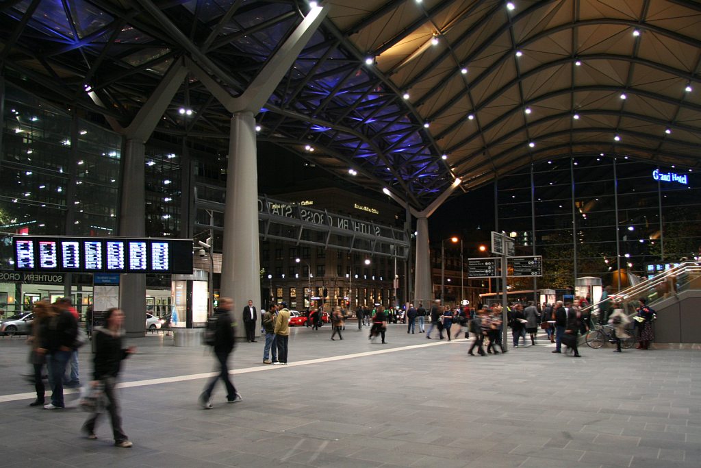
How to find your train at Flinders Street Station

You have arrived at Flinders Street Station and you’re trying to find where your trains leaves – so where do you look? You’re probably going to look at one of these screens – but what order are the trains being displayed in? It isn’t alphabetical – South Morang occupies the first two slots. Is it […]